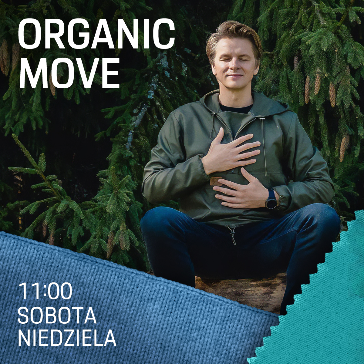
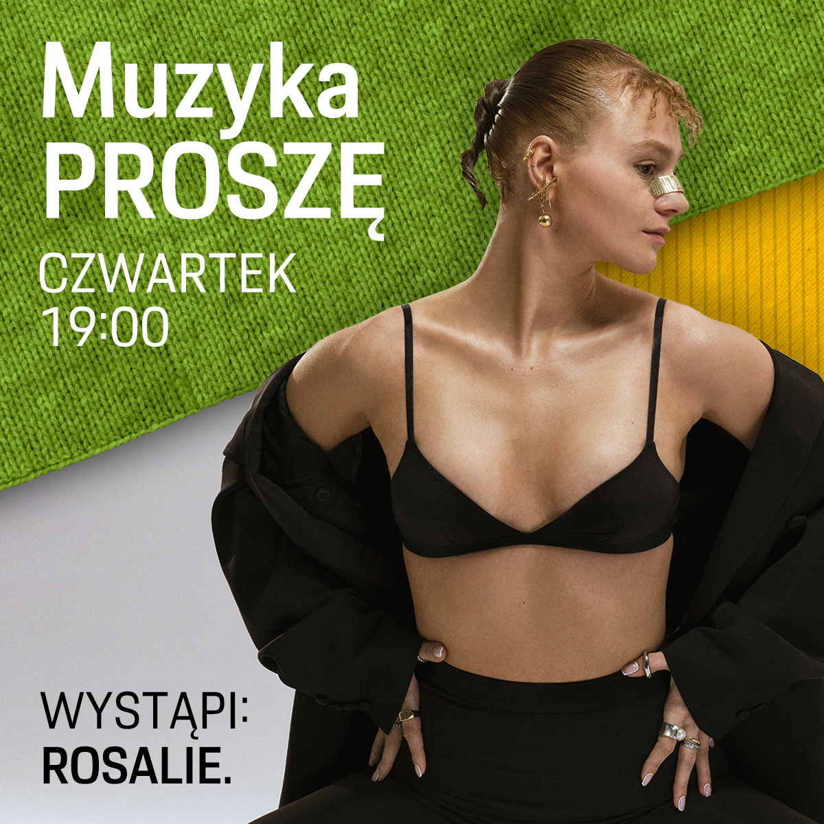
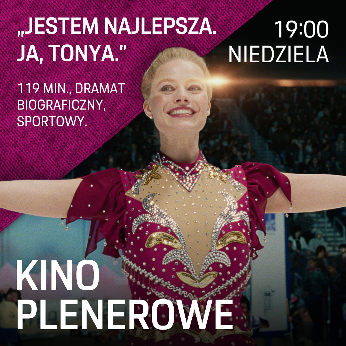
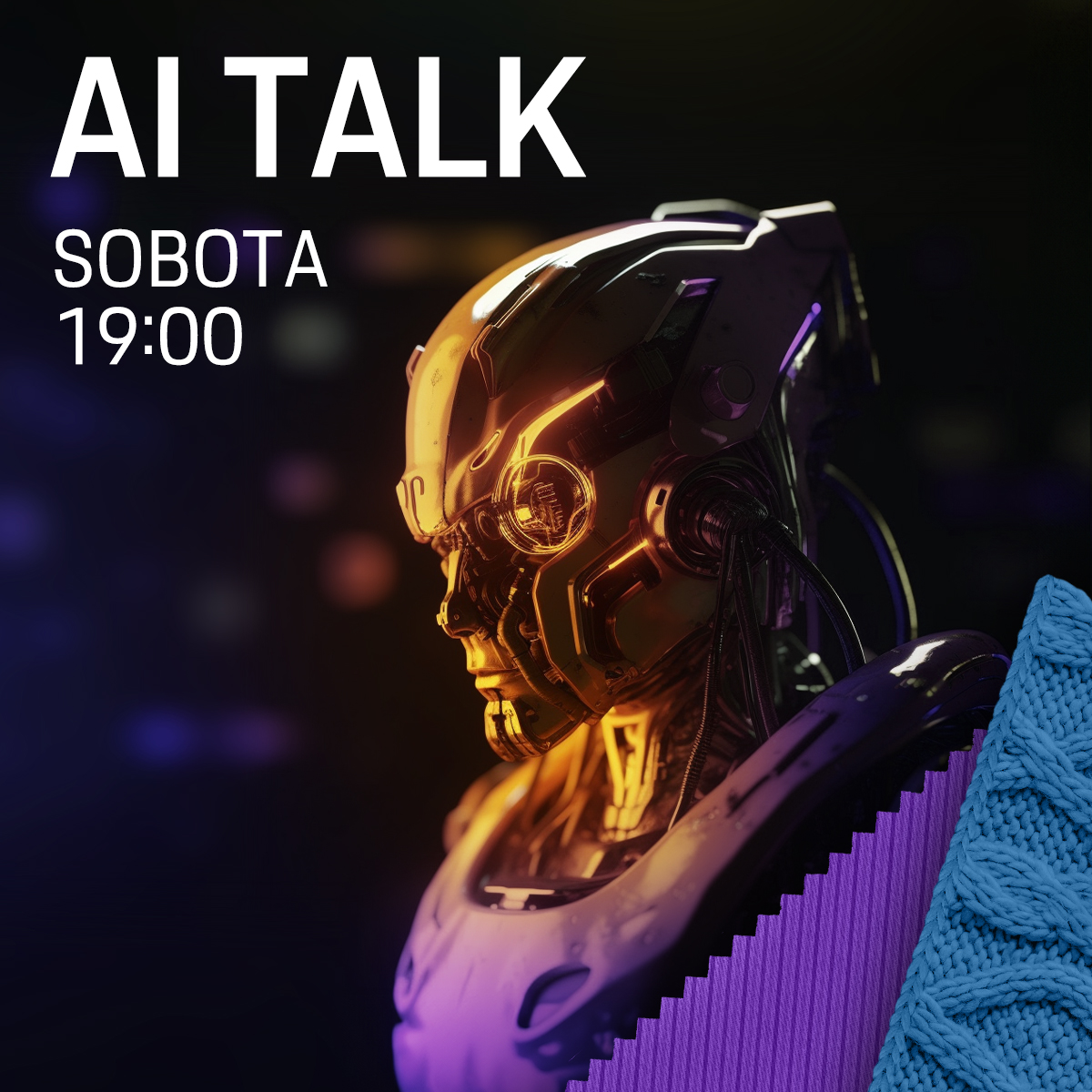
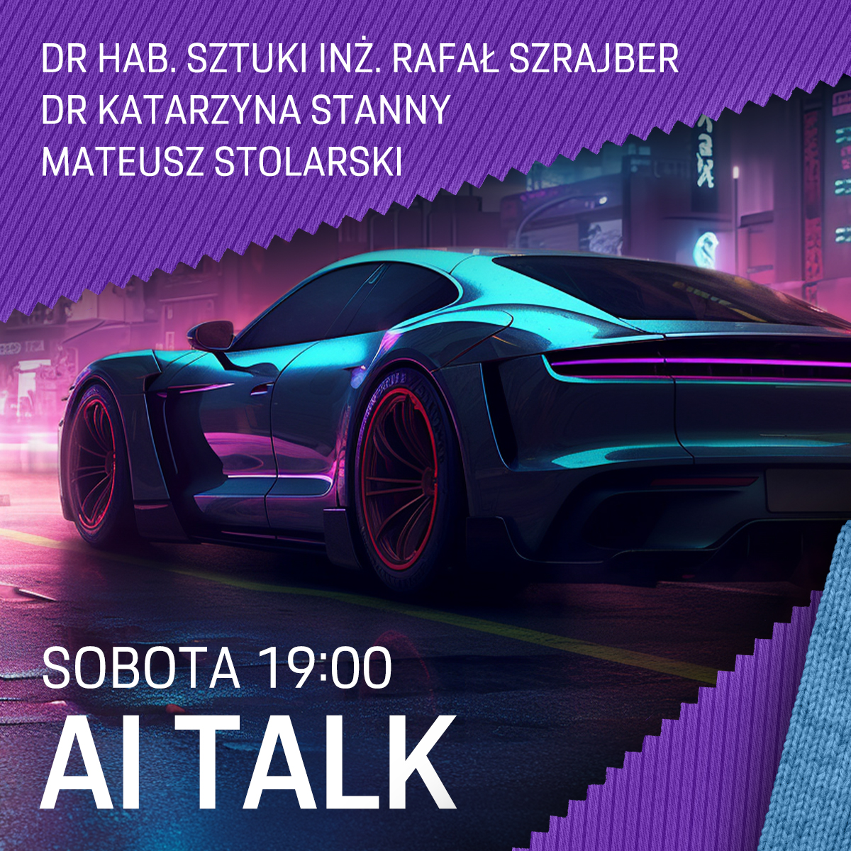
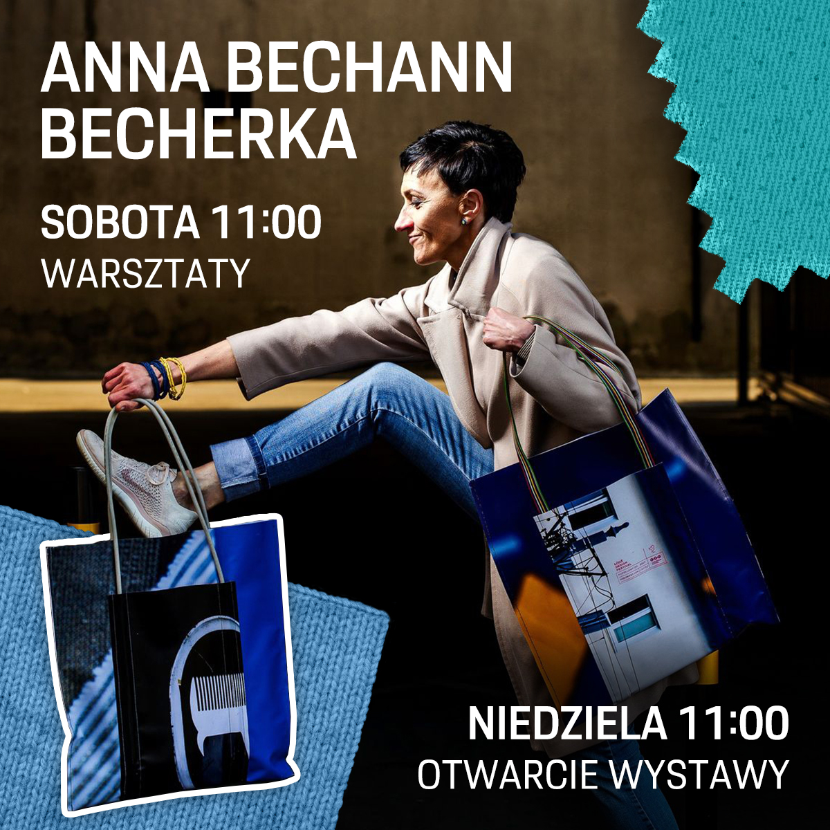
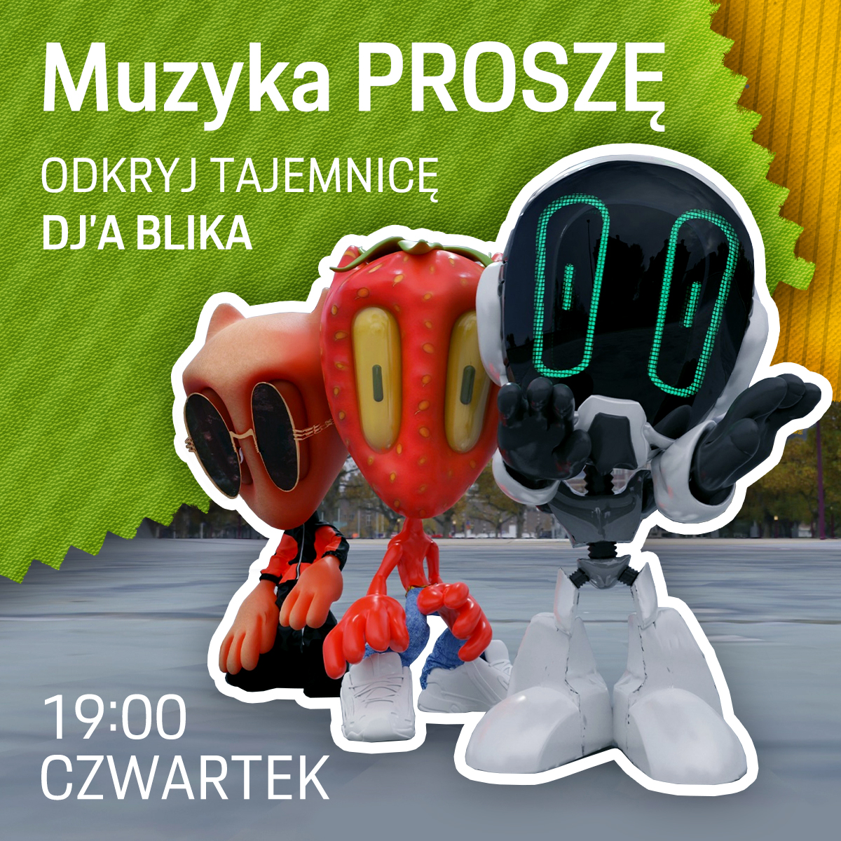
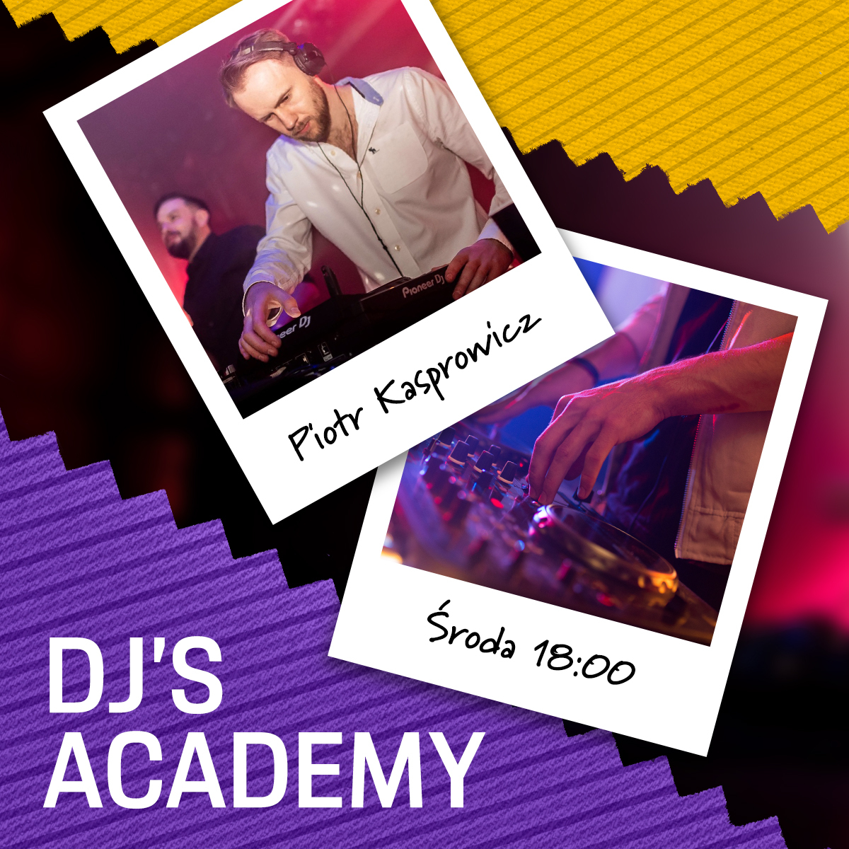
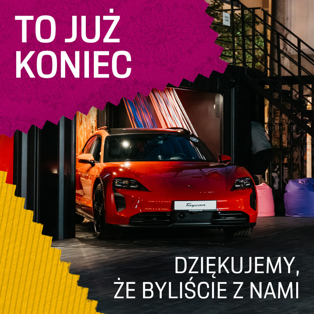
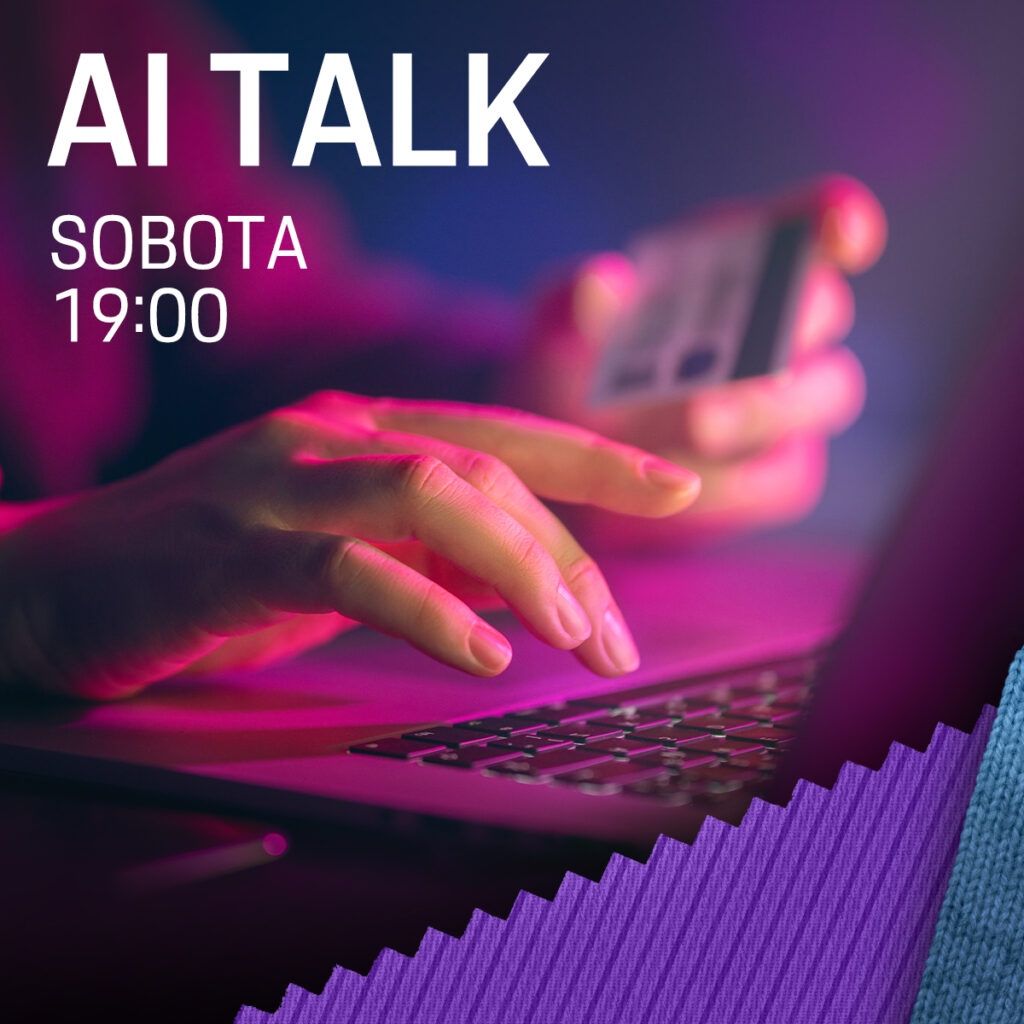
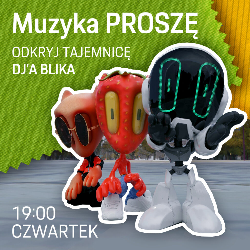
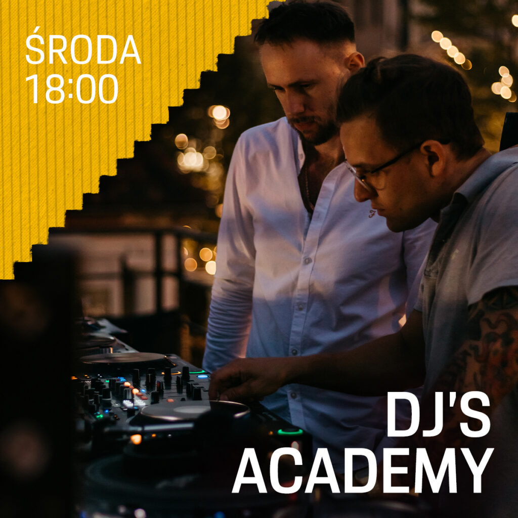
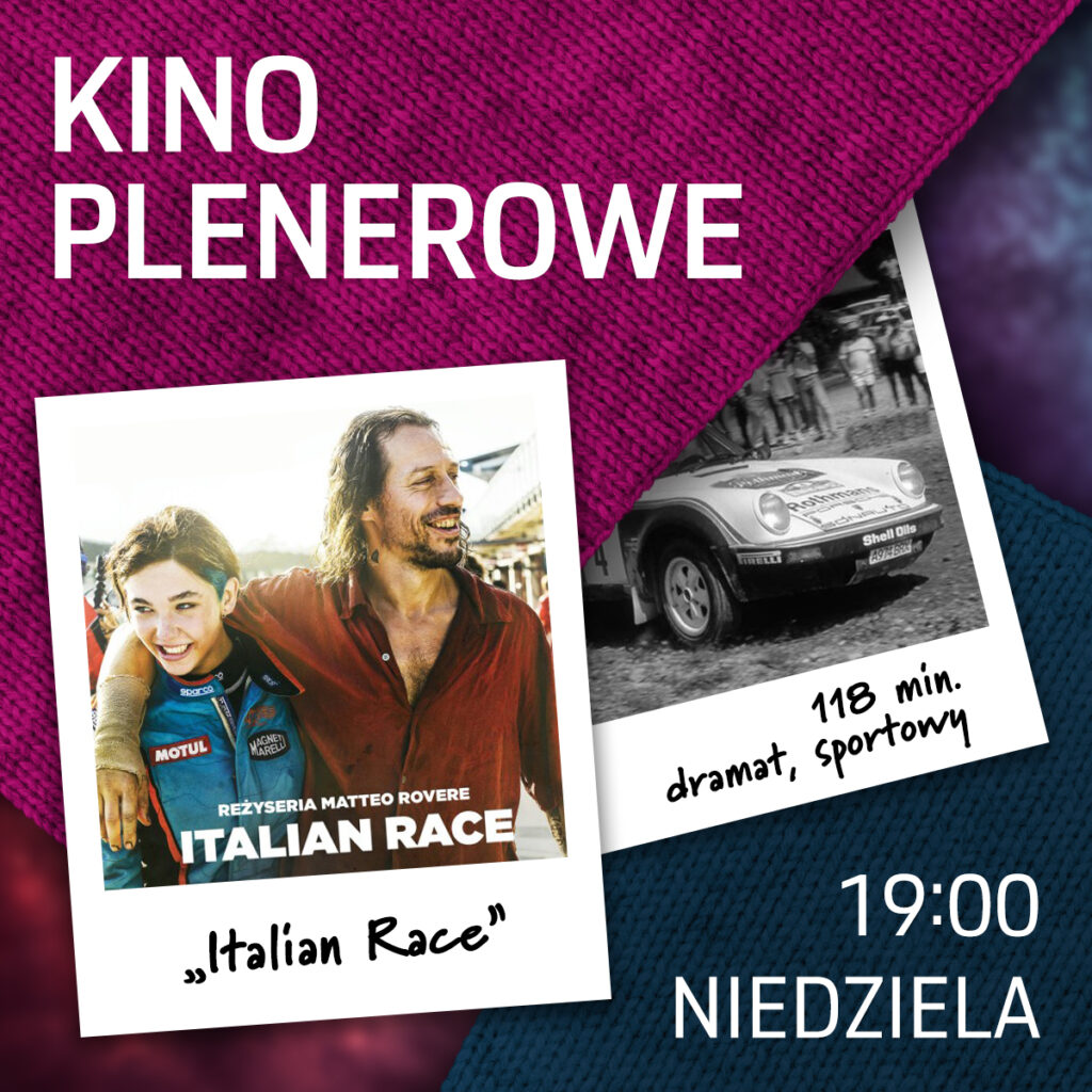
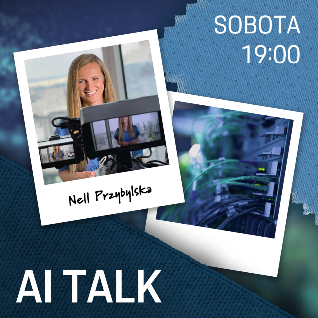
Preparation of social media graphic content (posts, stories) with information about events taking place during the operation of the space.
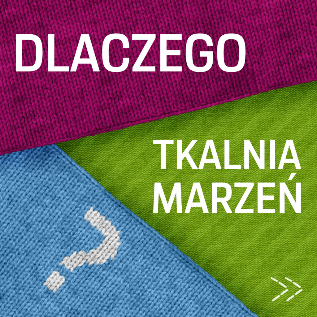
Dream Weaver
Key visuals, landing page and marketing materials for porsche pop-up store in Łódź
project
Details
The pop-up store was organized to celebrate the 75th anniversary of Porsche by the dealer Porsche Centrum Łódź, located in the artistic heart of the city of factories, once thriving to the rhythm of textile machines. This inspired the concept “Tkalnia Marzeń” (The Weaving Mill of Dreams) — a project combining the history of Łódź with the heritage of Porsche.
- Goals
- Promotion of the event through digital materials both before the opening and during the event.
- Development of the event concept for the Porsche dealer in Łódź.
- Providing ongoing updates about upcoming events for interested visitors.
- My role
- Created in collaboration with the Profitway agency.
key visuals
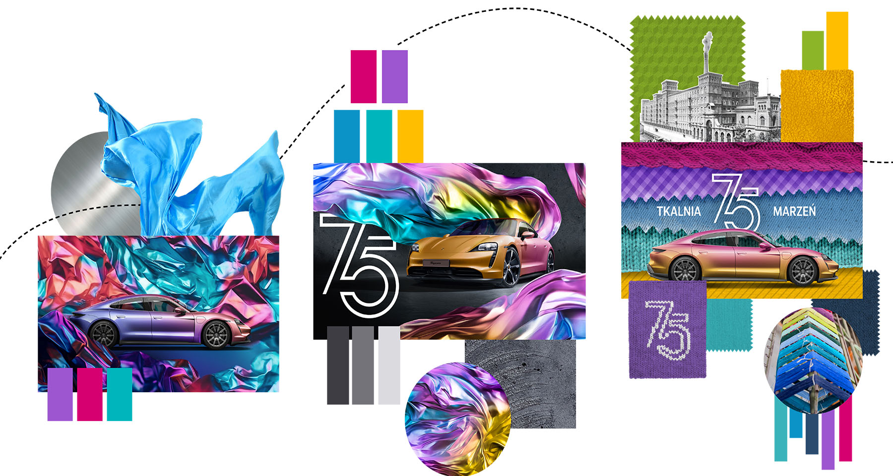
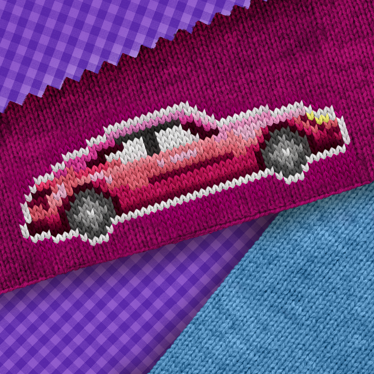
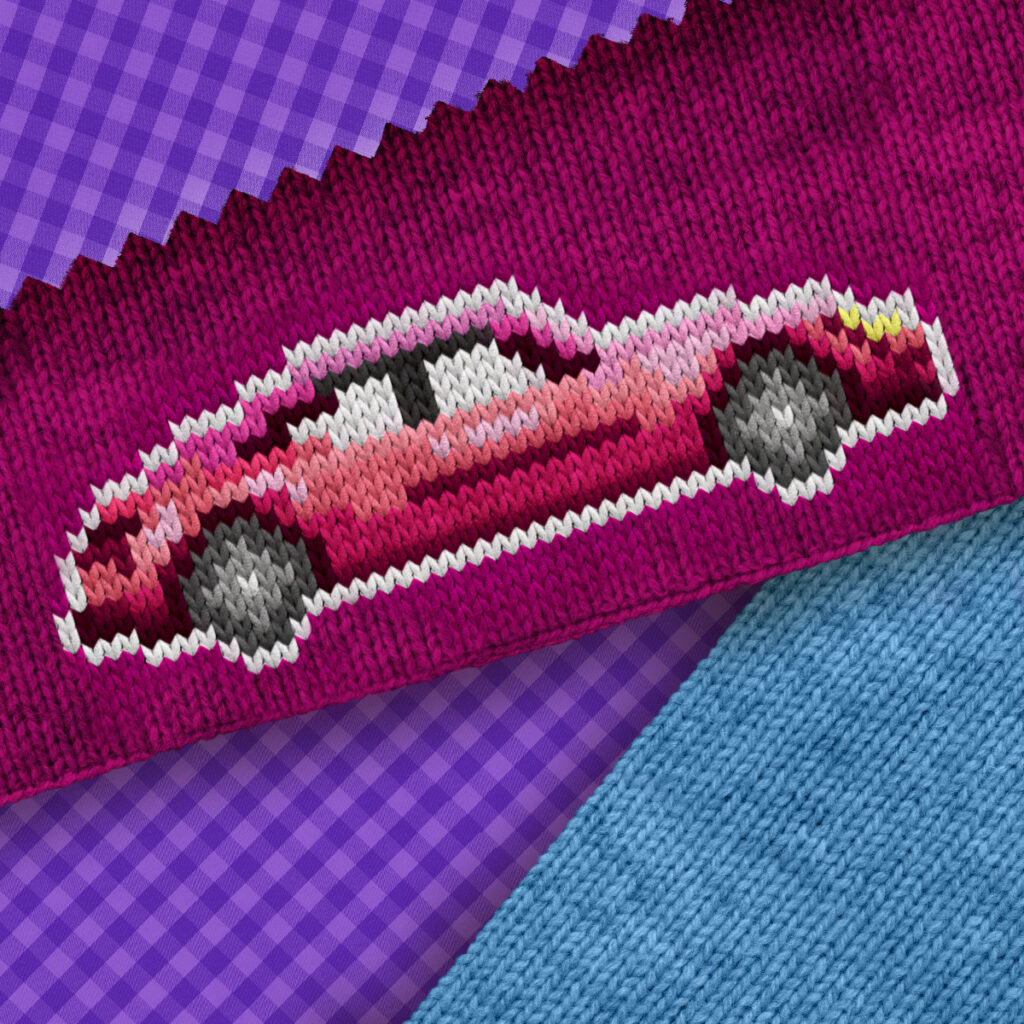
Fabric + Metal
An attempt to combine the cold metal of the car body with the texture of fabric, resulting in a metallic foil effect.
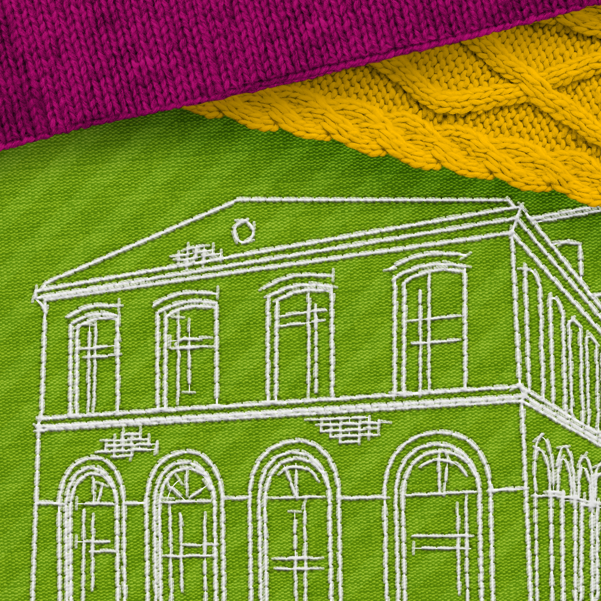
Colors + Concrete
A fusion of industrial, factory-style interiors of Łódź with the vibrant colors of Porsche.
Dream weaver
Inspired by the history of Łódź, alive with the rhythm of textile factories.
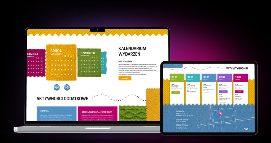
Landing page
The purpose of the landing page was to inform visitors about the opening of the pop-up store and to collect registrations for events with limited capacity. The page also included information such as the event schedule and the location of the venue.
Challenge
Aesthetics
Porsche is a brand deeply rooted in design and emotion, so the landing page promoting the anniversary pop-up store needed to be more experiential than purely informational.
The project required:
- creating a unique, artistic experience that reflects the character of the event
- working exclusively with the key visual, without additional assets (no photos or video)
- building curiosity and anticipation before the space even opened
The biggest challenge was the complete lack of content — the website was created long before the event launch, so everything had to rely on a creative interpretation of the visual identity.
Information
At the same time, the landing page had to function as an information and registration hub. The main challenges included:
- A highly complex schedule: recurring events (taking place more or less weekly), permanent activities (available daily during opening hours) or events that didn’t fit into either category (e.g. 2-week exhibitions combined with occasional workshops)
- Different participation rules: some events were open to everyone, others required registration
- Additionally, the program was constantly evolving during production
The key was to design a system that:
- would be clear and understandable for users
- would allow easy updates without restructuring the layout
My solution
UX Approach
The key decision was to divide events into recurring and permanent ones.
- For recurring events: I used a carousel structured around days of the week (days are fixed → events are variable). This made it easier for users to plan their visit. Events taking place on multiple days were split into separate entries to maintain a clear and consistent structure.
- For permanent events: I designed static tiles describing each activity. This layout allowed for easy addition or removal of activities without affecting the overall structure.
More detailed information about each event, as well as registration forms, was placed within pop-ups.
At the bottom of the page: a weekly schedule served as a summary, aligned with social media communication.
- Its purpose was to provide a clear overview of all events for a given week, giving users a single, reliable reference point.
- Additionally, events requiring registration were marked with dedicated call-to-action buttons.
Visual Design
The design was fully based on the key visual and expanded through:
- collage-like “fragments” of materials with different textures and colors
- handmade-inspired elements (e.g. embroidered map, knitted logo, buttons instead of icons)
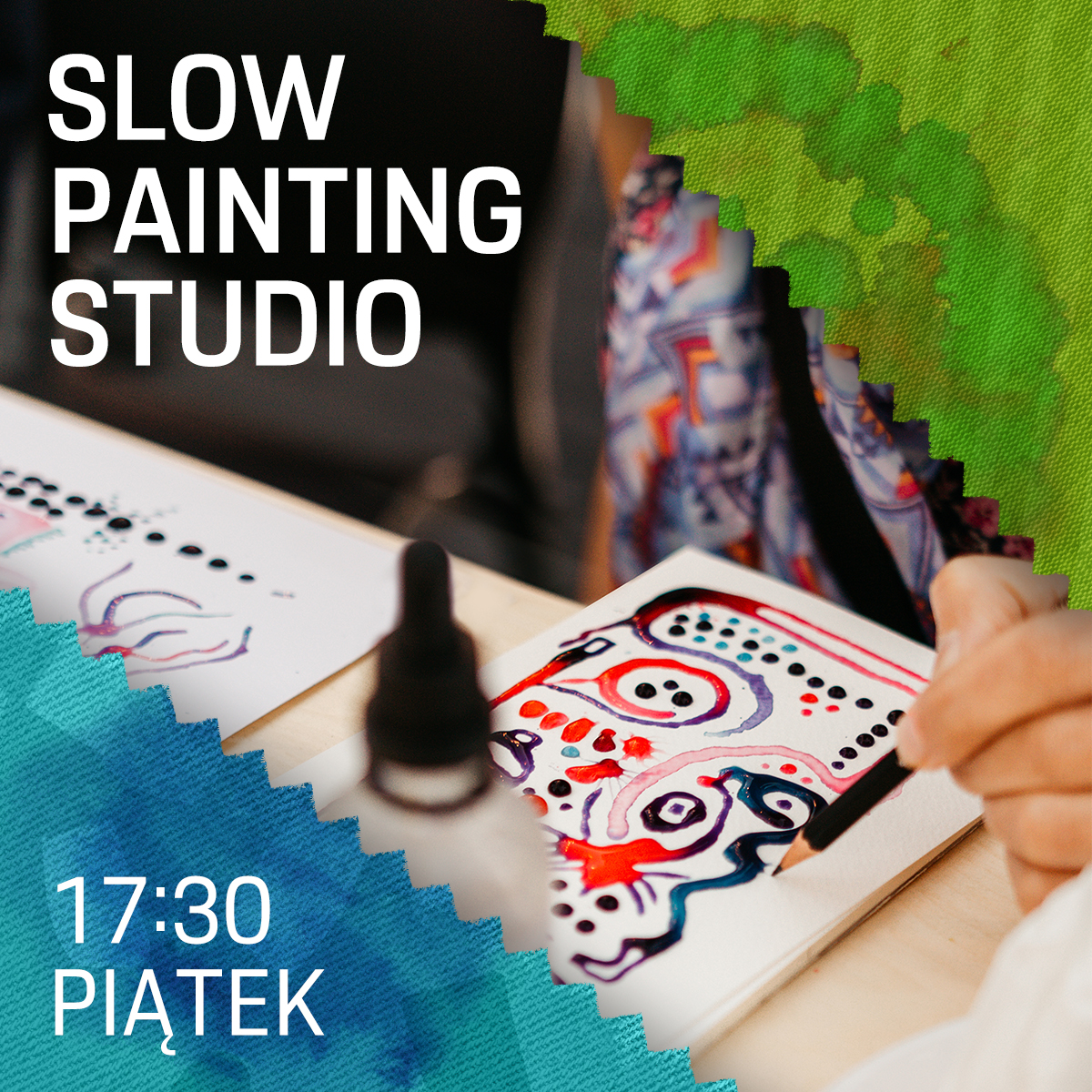
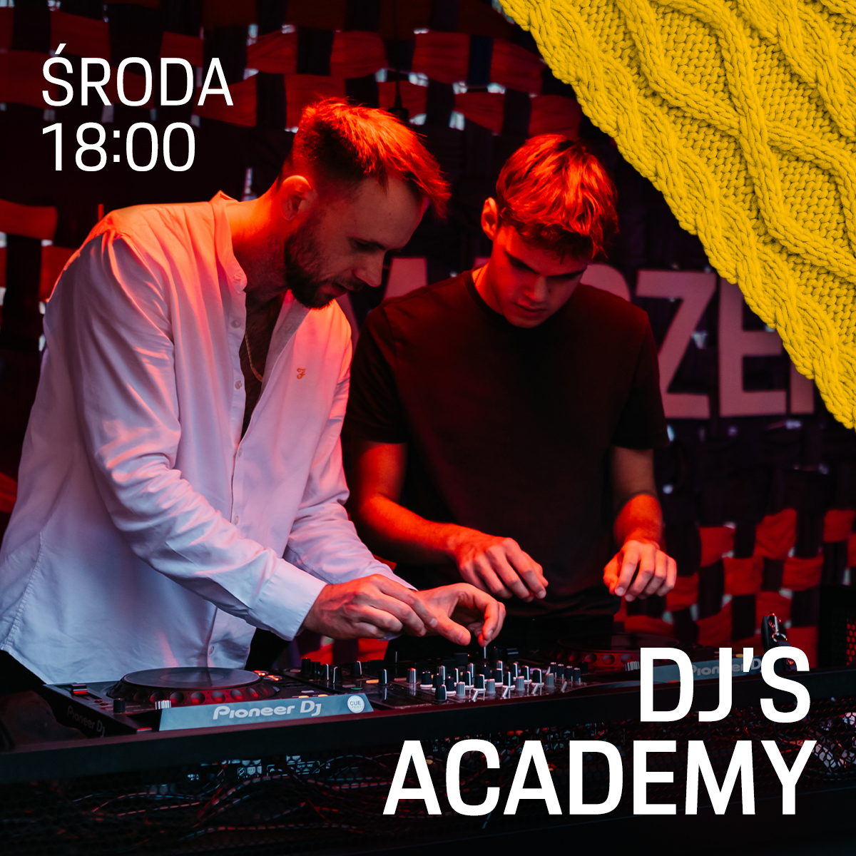
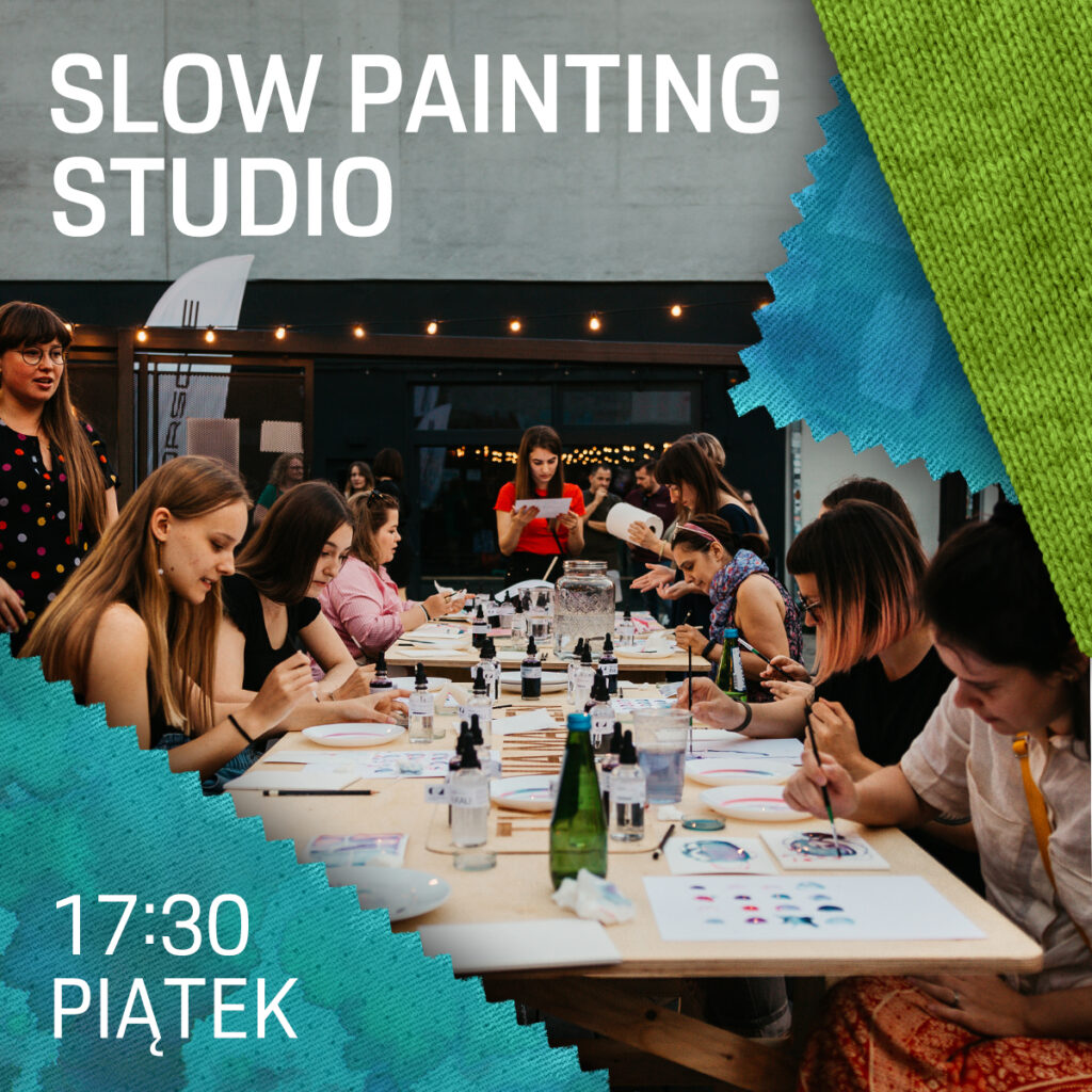
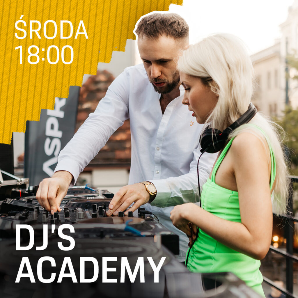
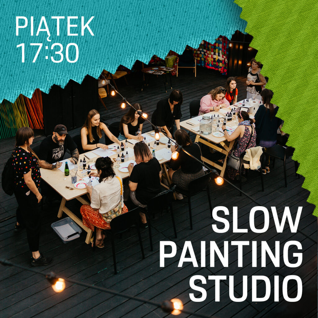
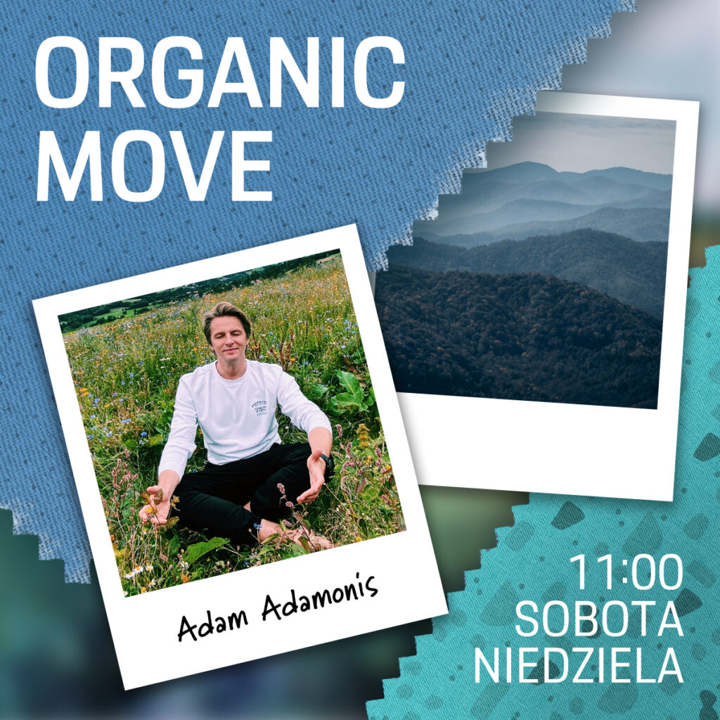
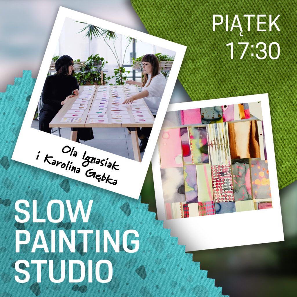
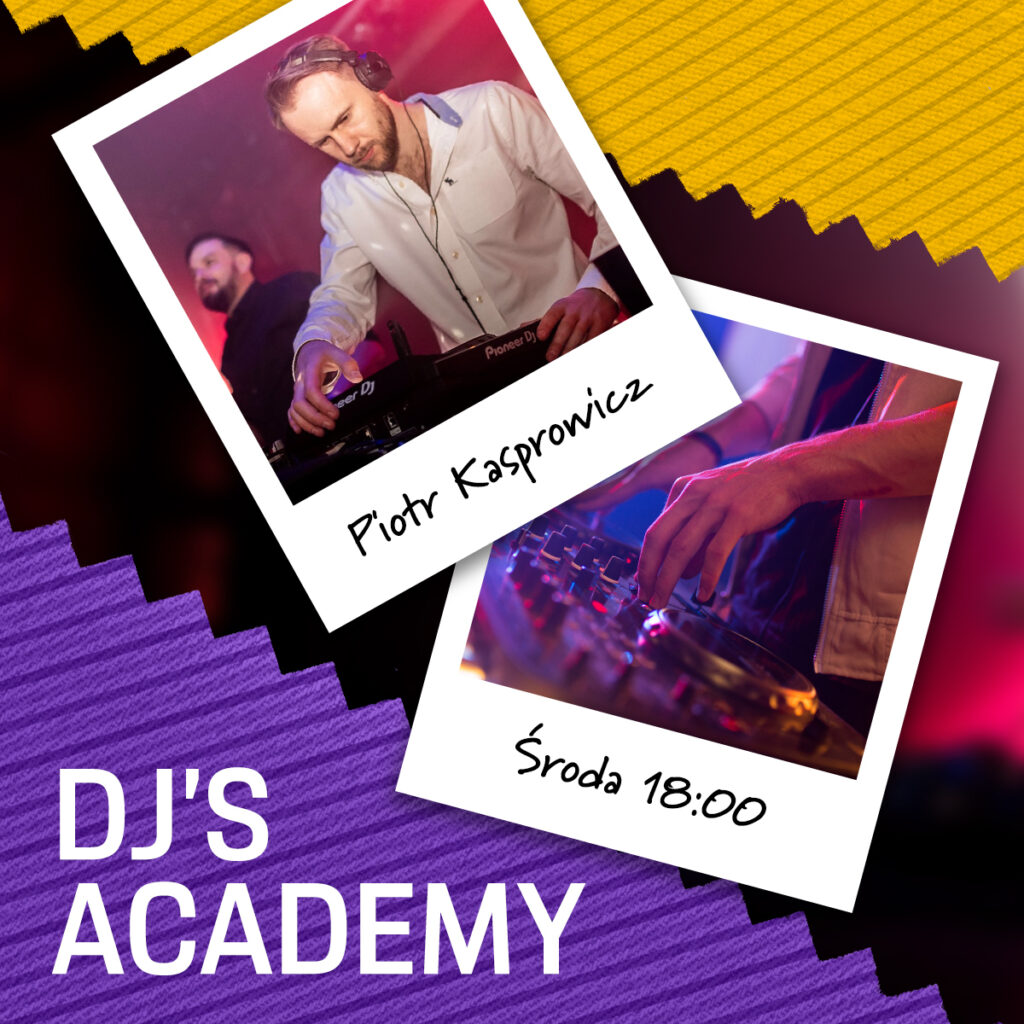
Additionally, I introduced a color system assigned to specific events (e.g. yellow → DJ’s Academy, turquoise → Slow Painting Studio).
This allowed:
- faster recognition of activities
- consistency with social media communication
Result
The final landing page:
- effectively built emotion and anticipation around the event
- allowed users to easily understand the program and register for activities
- remained flexible and resilient to constant schedule changes
The result was a combination of artistic expression and functional UX, consistent across both the website and marketing communication.
Visuals
Hero (imagery that connects Porsche and pop-up key visual)
Recurring events
carousel structured around days of the week
Permanent events
Static tiles describing each activity
Week harmo
Weekly sum-up to get everything together
About us
Map, opening hours, information about event organizer and social media
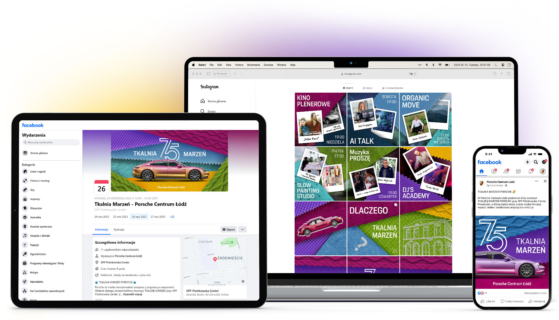
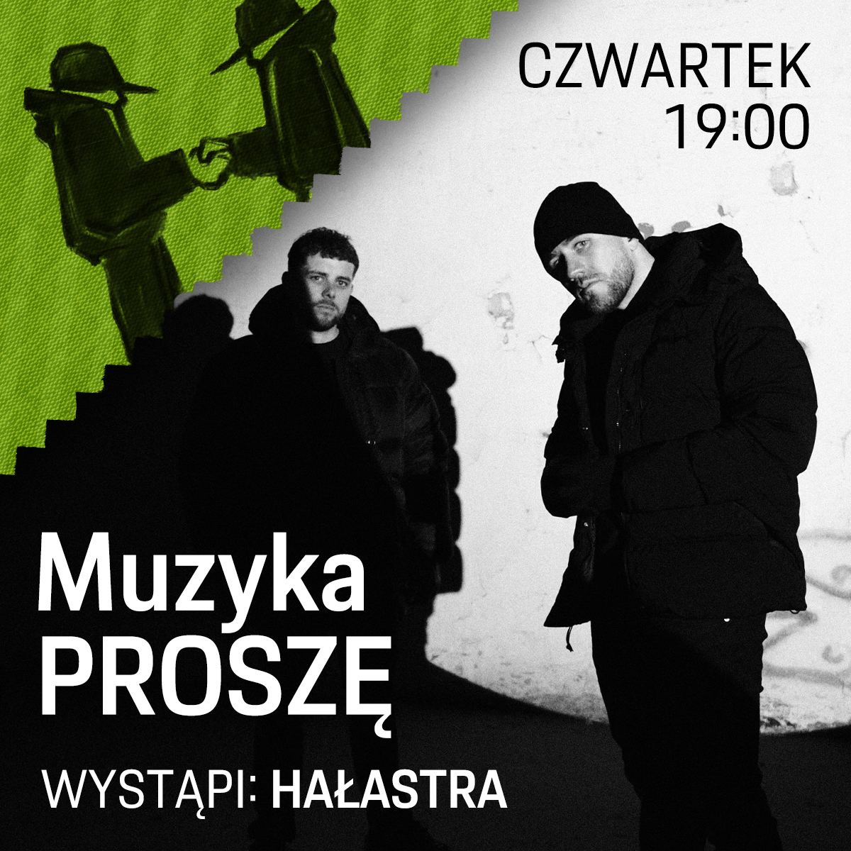
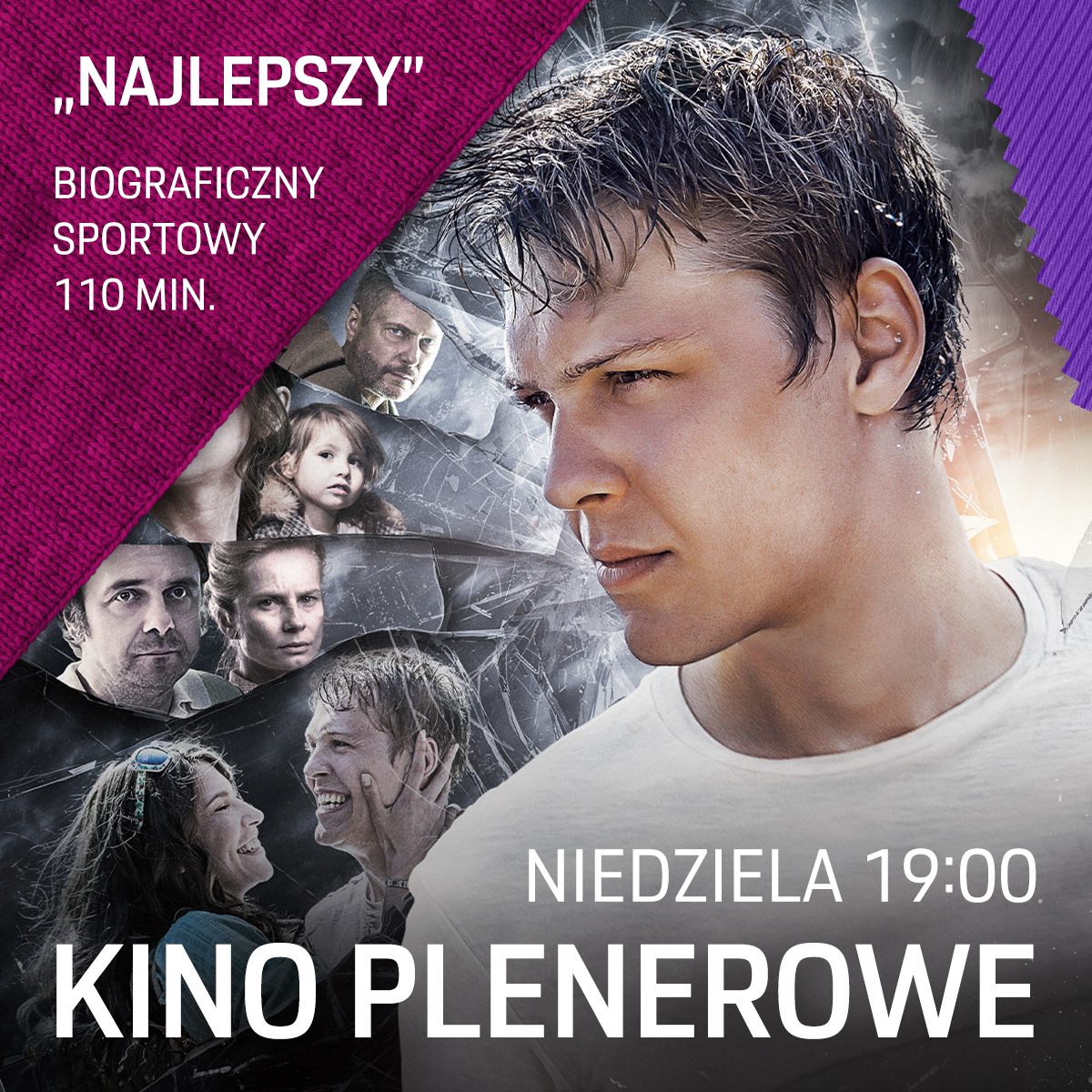
Social media
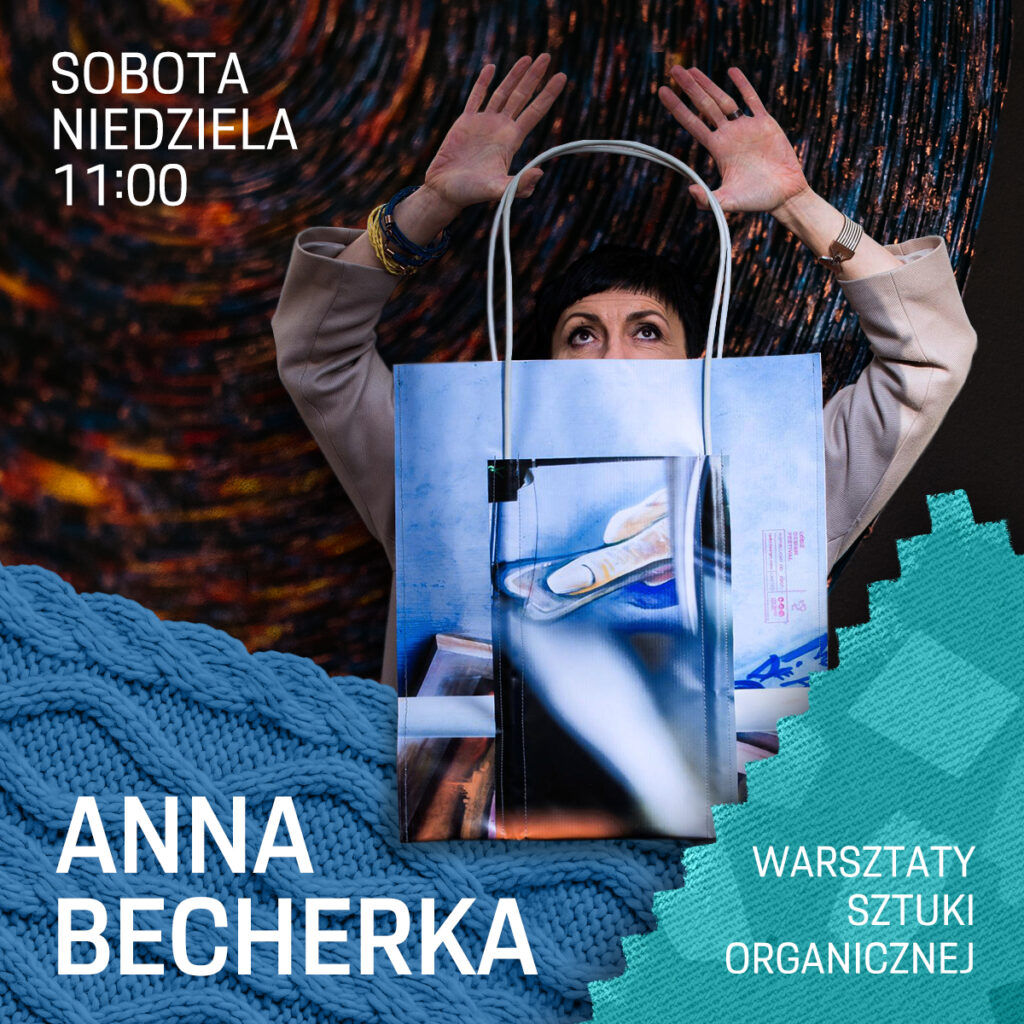
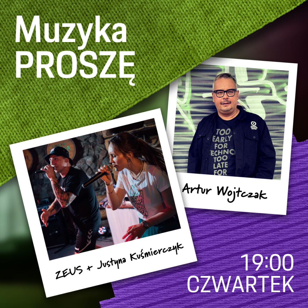
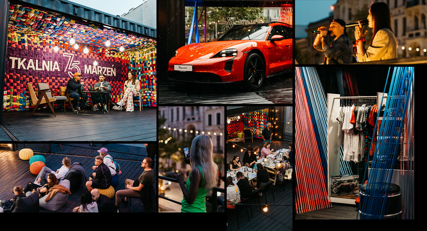
This was quite an interesting challenge because the promotion had to take place before the opening, without any photos from the event itself. It required a certain level of creativity. During the event, new visual materials were created continuously to inform audiences about upcoming activities and events.


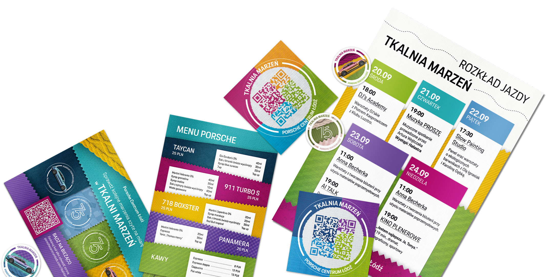
Printed materials
POS and informational materials, including posters with the event schedule, mocktail menus, and stickers available for visitors.
Workflow
Step by step
Brainstorm & Key Visual
Meeting with the Project Manager to define the direction of the whole Pop-up store. I prepared several graphic visualizations to define the visual direction and branding of the entire pop-up store — both in the physical space (set design, posters, and print materials) and in the digital environment (landing page, advertisements, and social media).
UX/UI Mockup for Landing Page
Presenting the visual and functional aspects – ideal for gathering feedback from the team and the client. Project ready for implementation by a web development company.
Digital Ads & Printed materials
Preparation of promotional materials for the launch — Meta Ads, a Facebook event, and printed materials available at the pop-up store.
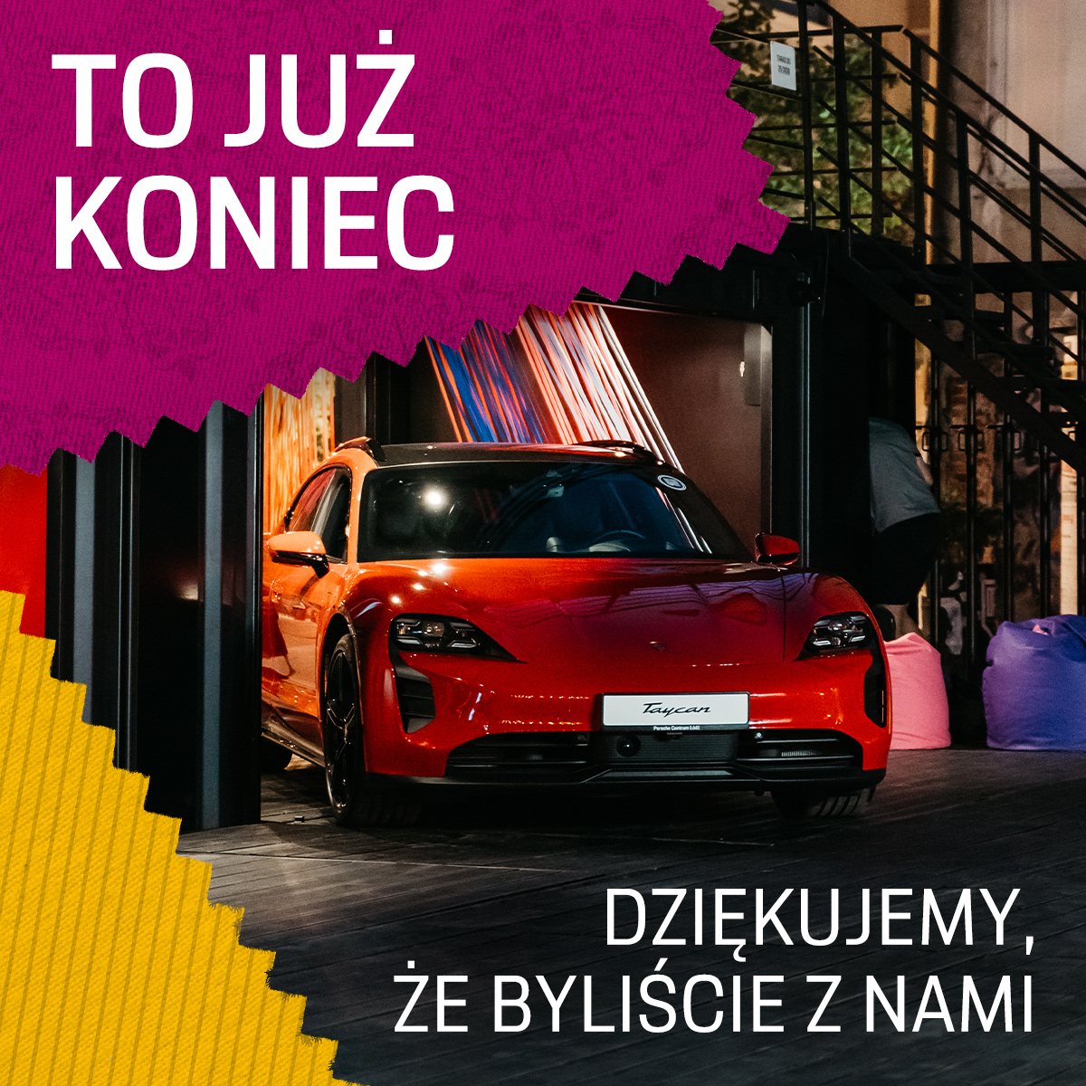
Store Opening