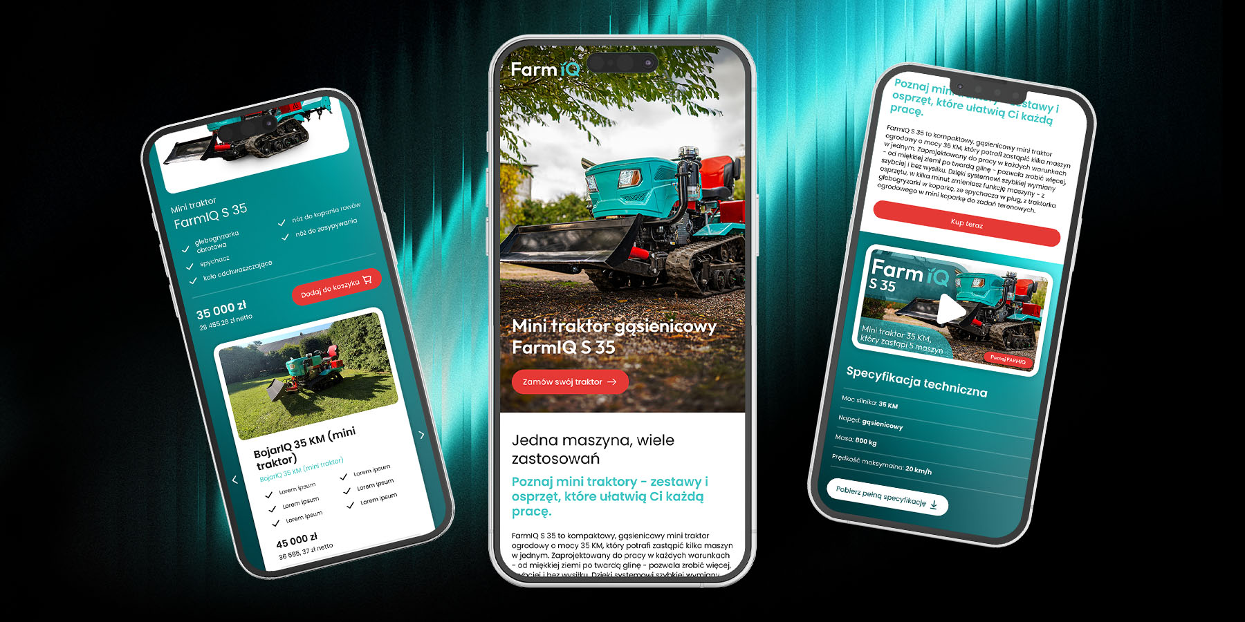
Implementation support and design supervision to ensure the website is functional, responsive, and consistent with the design prototype.
Challenge
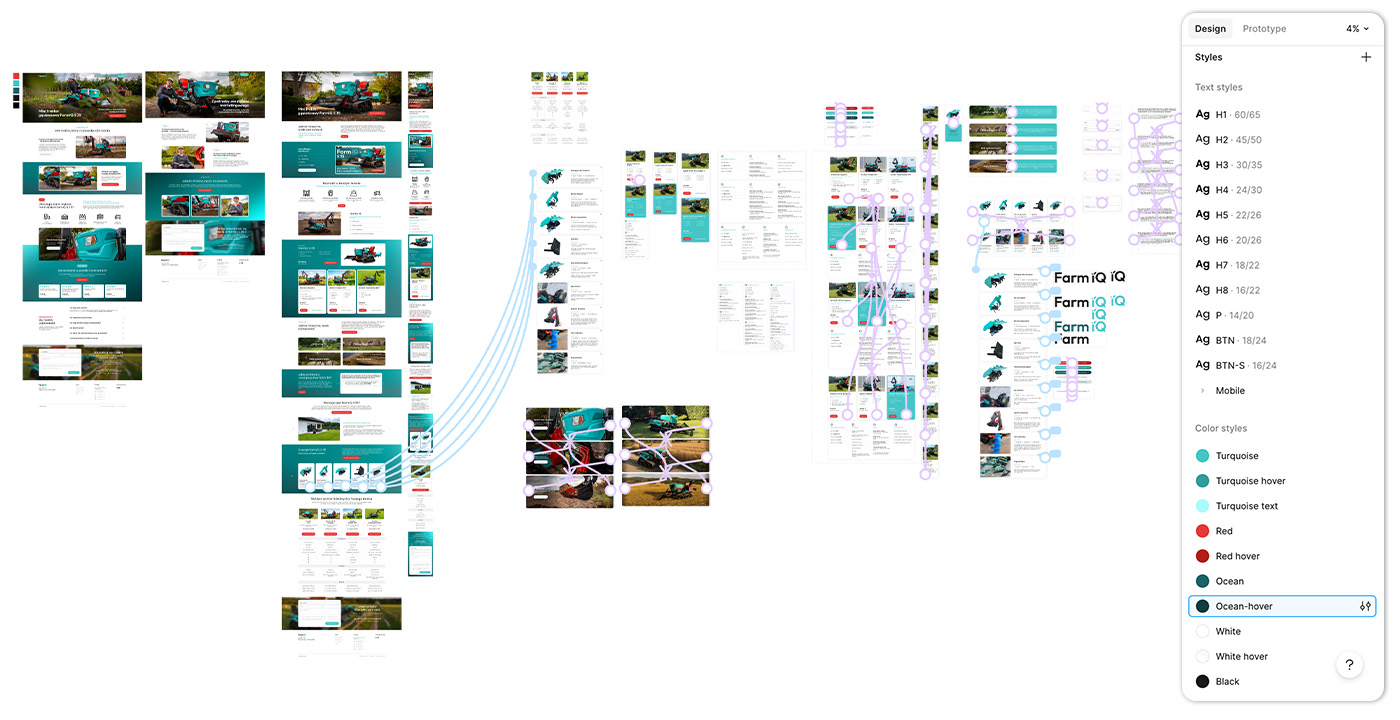
My solution
Result